Overview
The library splits “the system” from “the look.” The window manager, the dock, the menu bar, the windowing rules, the keyboard shortcuts: all of that is the skeleton. Themes are token bags that dress it.
Two ways themes flex
Section titled “Two ways themes flex”| Layer | What changes |
|---|---|
| Build-time | The consumer picks one theme at app boot. <Desktop theme={windowsTheme} /> vs. <Desktop theme={macosTheme} />. |
| Runtime | The end user tweaks a bounded subset via the Settings panel. The theme declares which tokens are open. |
Runtime themes are not full theme swaps. They are overlays: user prefs sit on top of the declared theme’s defaults, and only the paths the theme listed under customizable are applied. Stale prefs (a token the theme later removed) are silently ignored.
OsTheme shape
Section titled “OsTheme shape”| Field | Type | Description |
|---|---|---|
id | string | Theme id for storage namespacing. |
name | string | Display name shown in dev tooling. |
palette | OsThemePalette | · |
shape | OsThemeShape | · |
motion | OsThemeMotion | · |
blur | OsThemeBlur | · |
elevation? | OsThemeElevation | Window drop shadows. Optional: when a theme omits this, the components fall back to the neutral default elevation. A flat or retro theme can set both to `"none"`; a cinematic theme can deepen them. |
wallpaper | OsThemeWallpaper | · |
chrome | OsThemeChrome | · |
font? | string | Base CSS font-family for the desktop chrome. Each OS clone sets its platform stack: the SF/system stack on macOS, Segoe UI on Windows, the Ubuntu font on Ubuntu. The consumer is responsible for actually loading any non-system webfont (a `@font-face` or a font-host link). Optional; defaults to a neutral system stack. |
appearance? | ThemeAppearance | Preferred appearance. "auto" (the recommended default) follows the OS color scheme via `prefers-color-scheme`; "light"/"dark" force one. The desktop resolves this and, when the result is dark, overlays `appearances.dark`. Omitted means the theme has a single (light) look. |
appearances? | { light?: OsThemeAppearance; dark?: OsThemeAppearance } | Optional appearance variants. A theme authors its base palette in whichever mode is natural (macOS and Windows are light, Ubuntu is dark) and supplies the opposite mode here. When the resolved appearance matches a key present, its tokens overlay the base ones, so one object carries a light and a dark look. Expose `"appearance"` as a `customizable` select to let the end user switch between them. |
customizable? | Record<string, CustomizableField> | End-user tweakable subset of the theme. Keys are dotted paths into the theme object (e.g. `"palette.accent"`, `"shape.dockTileRadius"`). The Settings system app reads this map and renders one field per entry; the library persists the chosen value via the storage adapter and overlays it on top of the theme defaults to produce the effective theme. A theme that omits this field exposes no settings panel. A theme that supplies ten entries gets a ten-field panel for free. |
Six required token categories, an optional elevation token, and an optional customizable map. The library’s components consume tokens via useTheme().
What each category covers
Section titled “What each category covers”| Category | Drives |
|---|---|
palette | Surface colors, text colors, baseline accent, hairline borders. App accents override the baseline per-app. |
shape | Radii: windowRadius (large), dockTileRadius (squircle), small (pills, chips, tooltips). |
motion | Durations in milliseconds and easings as CSS strings. Window open, dock hover, minimize genie, plus the optional dockMagnification peak (set it to 1 to switch the fisheye off). |
blur | backdrop-filter strings for the menu bar / dock surface and for Spotlight separately. |
elevation | Optional. Focused and unfocused window drop shadows (windowFocused, windowUnfocused). Falls back to a neutral default; a flat theme can set both to "none". |
wallpaper | src (image URL), parallax (cursor-driven shift), vignette (dark radial overlay). |
chrome | Structural variants: window control style, dock position, dock style (floating pill vs flush taskbar), menu-bar placement, clock placement, and the Quick Settings popover toggle. |
chrome: the structural lever
Section titled “chrome: the structural lever”| Field | Type | Description |
|---|---|---|
windowControls | "traffic-lights" | "windows" | "gnome" | "minimal" | Window title-bar control style. `"traffic-lights"` is the macOS trio on the left; `"windows"` is the Windows 11 caption cluster flush in the top-right corner; `"gnome"` is the Adwaita/Yaru trio of round symbolic buttons on the right; `"minimal"` is a single close affordance. |
dockPosition | "bottom" | "left" | "hidden" | · |
dockStyle? | "floating" | "bar" | Dock form. `"floating"` is the macOS dock: a centered rounded pill that hovers above the edge with a gap. `"bar"` is the Windows taskbar / GNOME panel shape: a flat bar flush to the edge, spanning the full width (bottom) or height (left), square corners, an accent underline under running apps. Optional, defaults to `"floating"`. Ignored when `dockPosition` is `"hidden"`. |
launcher? | "spotlight" | "grid" | "menu" | Presentation of the app launcher / search surface. `"spotlight"` (default) is the macOS centered command palette; `"grid"` is the GNOME Activities app-grid overview (a full-bleed search field over a grid of app icons); `"menu"` is the Windows Start menu (a panel anchored above the dock launcher with a search field and a grid of app tiles). All three share the same results (apps, system windows, and `registerSpotlightSource` rows) and the same Cmd/Ctrl+K shortcut; only the layout changes. Build a fully custom launcher with the exported `useLauncher` hook. |
dockAlign? | "start" | "center" | "end" | How a `"bar"` dock packs its app icons along its long axis. `"center"` (default) is the macOS / Windows 11 placement; `"start"` packs them at the top (left dock) or left (bottom dock), the GNOME / Ubuntu and Windows 10 placement, leaving the launcher at the far end; `"end"` packs them at the far end. Ignored by the `"floating"` dock, whose pill always hugs its icons. Windows 11 exposes the same lever as "Taskbar alignment". |
menuBar | "top" | "in-window" | "none" | · |
menuBarClock? | "right" | "center" | Where the clock sits in the top menu bar. `"right"` (default) is the macOS placement, in the status cluster. `"center"` adopts the GNOME top-bar arrangement: the clock and date sit centered, the workspace switcher moves to the left, and the status indicators stay on the right. Ignored unless `menuBar` is `"top"`. |
menuBarBrand? | boolean | Whether the top menu bar carries the brand button on the left (the macOS Apple-menu analog that opens About / Settings). Defaults to true. A GNOME-style theme sets false: the top-left then holds only the workspace switcher, and system actions stay reachable through Quick Settings, Spotlight, and the keyboard. Ignored unless `menuBar` is `"top"`. |
quickSettings? | boolean | When true, the menu-bar status cluster becomes a single button that opens the Quick Settings popover (the GNOME system menu, the macOS Control Center, the Windows quick settings flyout). Populate the popover with `registerQuickSetting(...)`. Optional, defaults to false. Ignored unless `menuBar` is `"top"`. |
showDesktopButton? | boolean | When true, a thin sliver at the far trailing corner of a bottom `"bar"` dock acts as the Windows "Show desktop" button: one click minimizes every window on the active workspace, a second click restores the ones it minimized. Mirrors the Win+D toggle. Optional, defaults to false. Ignored by the floating dock and the vertical (left) bar. Source: https://support.microsoft.com/en-us/windows/customize-the-taskbar-in-windows-0657a50f-0cc7-dbfd-ae6b-05020b195b07 |
taskViewButton? | boolean | When true, a Task View button sits in the leading cluster of a bottom `"bar"` dock, beside the launcher. It opens the all-windows overview (Mission Control), the Windows 11 "Task View" taskbar button (Win+Tab). Optional, defaults to false. Ignored by the floating dock and the vertical (left) bar. Source: https://support.microsoft.com/en-us/windows/customize-the-taskbar-in-windows-0657a50f-0cc7-dbfd-ae6b-05020b195b07 |
taskbarContextMenu? | boolean | When true, right-clicking an empty part of a `"bar"` dock opens a context menu with a "Taskbar settings" entry that opens the Settings window, the Windows 11 entry point to taskbar customization. Optional, defaults to false. Right-clicking an app tile keeps its own menu. Source: https://support.microsoft.com/en-us/windows/customize-the-taskbar-in-windows-0657a50f-0cc7-dbfd-ae6b-05020b195b07 |
dockAutoHide? | boolean | When true, a `"bar"` dock hides itself off the edge and slides back in only while the pointer is at that edge or over the bar, the Windows "Automatically hide the taskbar" behavior. While hidden it reserves no work area, so windows fill the space and the bar overlays them on reveal. Optional, defaults to false. Ignored by the floating dock. Source: https://support.microsoft.com/en-us/windows/customize-the-taskbar-in-windows-0657a50f-0cc7-dbfd-ae6b-05020b195b07 |
dockTileSize? | number | Resting size in px of a dock tile/button, set per platform to match its reference: the floating macOS dock tile (~56), the Windows taskbar button (~40, for 24px icons), or the Ubuntu dock tile (~56, for ~46px icons). A `"bar"` dock derives its thickness (taskbar height / dock width) from this. Optional; defaults to the viewport metric for the dock form, and compact viewports shrink it. |
dockIconScale? | number | Icon glyph size as a fraction of the tile (0..1). Windows taskbar icons sit near 0.6 (24px in a 40px tile); Ubuntu dock icons nearly fill the tile (~0.82); macOS ~0.6. Optional, defaults to 0.5. |
menuBarHeight? | number | Top menu bar height in px, per platform: macOS 24, the GNOME top bar ~30. Optional, defaults to 24. Ignored unless `menuBar` is `"top"`. |
menuBarStyle? | "translucent" | "transparent" | Top menu bar material. `"translucent"` (default) paints the bar with the theme surface and blur; `"transparent"` makes it invisible (no fill, blur, or hairline) so the wallpaper shows through, the macOS Tahoe default. Ignored unless `menuBar` is `"top"`. |
liquidGlass? | boolean | Opt-in Liquid Glass refraction (Tahoe). When on, supported browsers warp the backdrop with an SVG displacement filter instead of only blurring it. This is **Chromium-only** (Safari/Firefox do not expose SVG filters in `backdrop-filter`) and is feature-detected at runtime: unsupported browsers and SSR fall back to the plain blur. Off by default; experimental. |
iconStyle? | string | Icon style this theme requests for app icons (e.g. `"fluent"` on Windows, `"macos"`, `"gnome"`). An app's `icons[iconStyle]` is used when present, otherwise its default `icon`. Optional; when unset every app uses `icon`. |
launcherIcon? | "windows" | "grid" | "dots" | "ubuntu" | Glyph drawn on the dock launcher button, overriding the default derived from `launcher`. `"windows"` is the four-pane Start mark, `"grid"` the GNOME 9-dot app grid, `"dots"` the neutral 2x2, and `"ubuntu"` the Ubuntu Circle of Friends (current Ubuntu themes its Show Applications button with the distro logo rather than the upstream grid). Optional; defaults to the glyph for the active launcher. |
launcherIconSrc? | string | URL of a consumer-supplied launcher-button icon (e.g. the real Ubuntu Show Applications glyph). When set it takes precedence over `launcherIcon` and is rendered as a symbolic mask recolored to the chrome foreground, so a monochrome SVG inherits the theme's text color. Themes do not bundle assets; the consumer passes the path, the same split as `wallpaper.src`. |
This is the part that does not exist in component libraries. It is what lets a SaaS dashboard hide the wallpaper and put the dock on the left, and lets a maker tool keep the full macOS register. Same components, different stance.
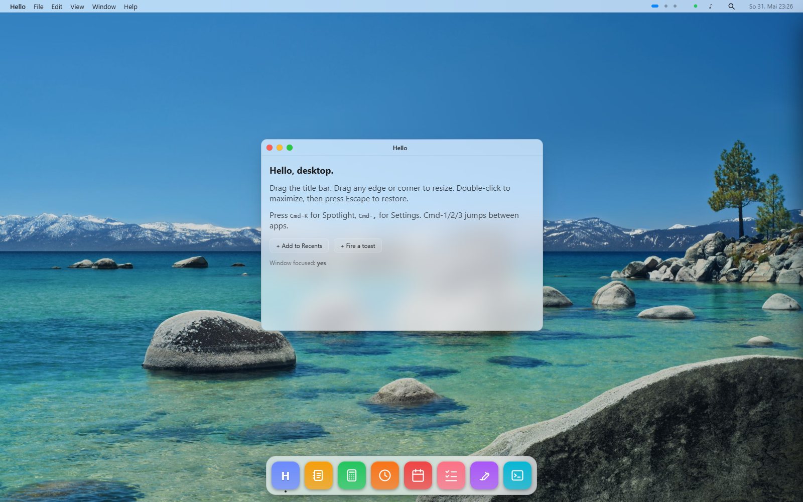
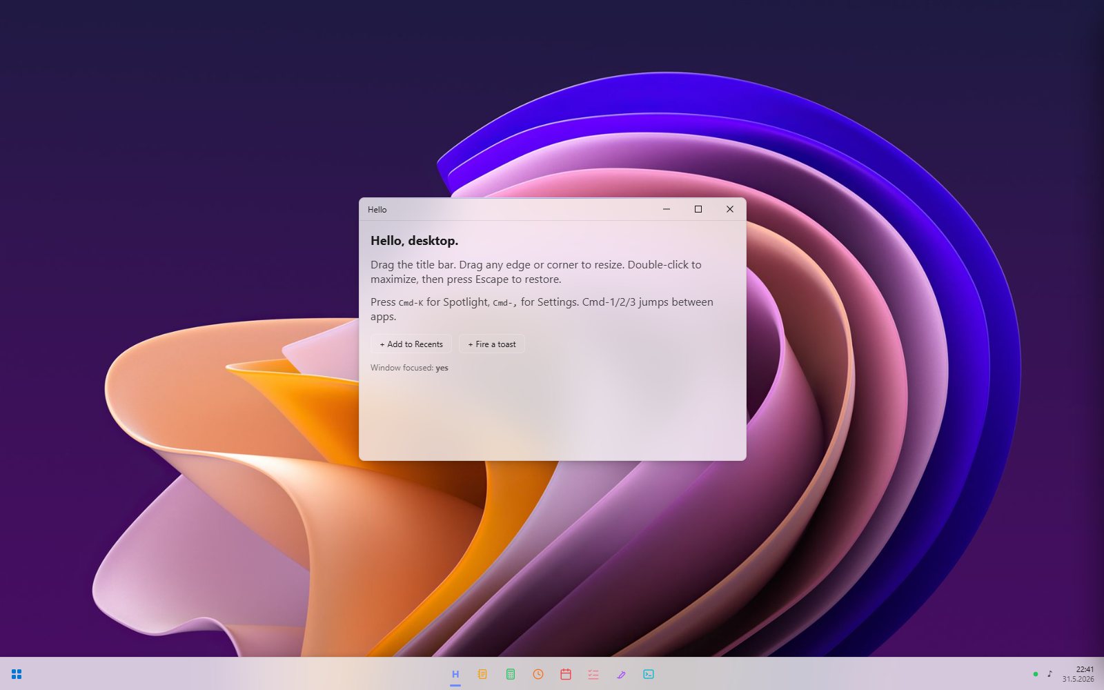
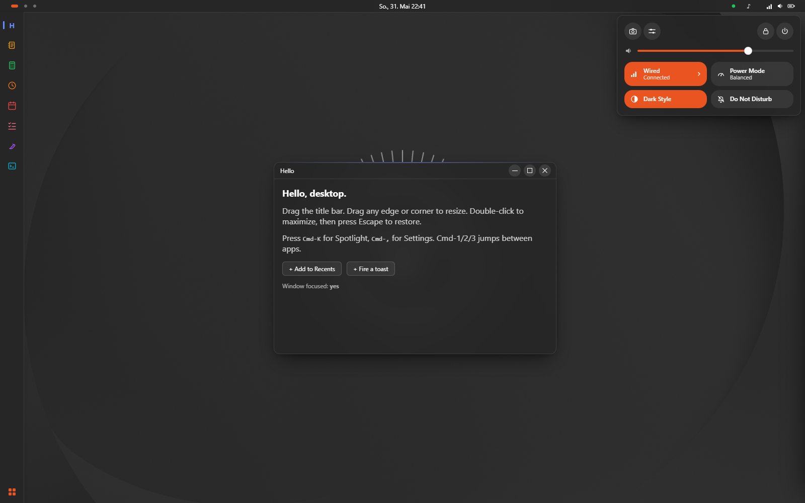
windowControls has four registers: "traffic-lights" (macOS, on the left), "windows" (a minimize / maximize / close caption cluster on the right, close turning red on hover), "gnome" (the Adwaita / Yaru trio of round symbolic buttons on the right, neutral hover), and "minimal" (a single close glyph). The Windows theme below picks "windows"; the Ubuntu theme picks "gnome"; the macOS default theme picks "traffic-lights".
dockStyle chooses the dock’s form: "floating" (the macOS dock, a centered rounded pill that hovers above the edge) or "bar" (the Windows taskbar / GNOME panel shape, a flat bar flush to the edge, full width on the bottom or full height on the left, with an accent underline under running apps). It defaults to "floating"; Windows and Ubuntu set "bar". dockAlign then packs a bar dock’s icons "center" (macOS, Windows 11), "start" (GNOME, Windows 10), or "end"; Ubuntu sets "start" so the icons sit at the top with the launcher at the bottom.
A few more chrome tokens dress the top bar. menuBarClock places the clock "right" (the macOS default, in the status cluster) or "center" (the GNOME placement, with the status indicators kept on the right and the workspace switcher on the left). menuBarBrand (default true) controls whether the bar carries the brand button; the macOS app-menu pattern reads as a relic in the GNOME register, so the Ubuntu theme sets it false and leaves the top-left to the workspace switcher. quickSettings, when true, turns the menu-bar status cluster into a single button that opens the Quick Settings popover. The Ubuntu theme sets all three.
launcher picks how the app launcher presents: "spotlight" (the macOS centered palette, default), "grid" (the GNOME Activities app grid), or "menu" (the Windows Start menu). All three share the same results and the Cmd-K shortcut; Ubuntu sets "grid" and Windows sets "menu".
Themes that ship
Section titled “Themes that ship”| Package | Stance |
|---|---|
@react-ui-os/theme-macos | macOS clone. Traffic lights, a floating dock with a fisheye, a translucent top menu bar, the Tahoe wallpaper. Light and dark appearance, following the system by default. With no wallpaper it doubles as the bare skeleton. Call createMacosTheme({ wallpaperSrc }). |
@react-ui-os/theme-windows | Windows clone. Caption-button window controls, a bottom taskbar that does not magnify, a Start launcher, no menu bar. Light and dark (Mica) appearance, following the system by default. Exercises chrome.windowControls: "windows" and motion.dockMagnification: 1. |
@react-ui-os/theme-ubuntu | Ubuntu (GNOME) clone. Yaru palette (light and dark, following the system by default), Ubuntu orange, a left bar dock, round symbolic window controls, a centered clock, and a Quick Settings popover. The only theme that pairs a top menu bar with a left dock. |
The same components, in the macOS stance: traffic-light windows, a floating dock with a fisheye, a translucent menu bar, on the Tahoe wallpaper.
And in the Windows stance: caption-button windows, a bottom taskbar with a Start launcher and a clock, on a Windows 11 wallpaper.
And in the Ubuntu stance: a top bar with a centered clock, a left bar dock, round symbolic window controls, and the Quick Settings popover open at the right.
Light and dark appearance
Section titled “Light and dark appearance”A theme ships both a light and a dark look from one object. Author the base palette in whichever mode is natural, then supply the opposite under appearances (typically palette and elevation); everything else, including the accent, is inherited from the base. macOS and Windows are light with a dark variant; Ubuntu is dark with a light variant. Set appearance to "auto" to follow the OS color scheme (prefers-color-scheme), or "light" / "dark" to force one. The desktop resolves it live, so an “auto” theme tracks the system as it flips.
appearance: "auto",appearances: { // A light-base theme supplies its dark variant (Ubuntu supplies `light`). dark: { palette: { background: "#1e2129", surface: "rgba(28,30,38,0.78)", textPrimary: "#f1f3f8" }, },},Expose the switch to the end user by adding an "appearance" select to customizable (Auto / Light / Dark); the Settings window renders it like any other field. All three reference themes do this, defaulting to Auto. A theme that declares neither variant is single-look, and the overlay is a no-op.
Wallpaper
Section titled “Wallpaper”The wallpaper is wallpaper.src. It can differ per appearance: the light-base themes take a darkWallpaperSrc (used in dark mode) and the dark-base Ubuntu takes a lightWallpaperSrc, each wired into the matching appearances[mode].wallpaper.src. Toggling light/dark then swaps the backdrop, not just the chrome.
The desktop never pops the wallpaper in like a web image: each one is decoded off-screen first, then dissolves in over the theme’s base color, and a change crossfades the new image over the old. The fade follows the GNOME model (which waits for the background to load before revealing it) and honors prefers-reduced-motion by skipping the dissolve.
To let the end user choose a wallpaper, pass wallpaperOptions (a list of { src, label }) to the theme factory; the theme then exposes an image-pick “Wallpaper” field in Settings > Appearance. A pick overrides the appearance default at wallpaper.src until the field is reset.
Picking a theme
Section titled “Picking a theme”import { macosTheme, createMacosTheme } from "@react-ui-os/theme-macos";import { createWindowsTheme } from "@react-ui-os/theme-windows";import { createUbuntuTheme } from "@react-ui-os/theme-ubuntu";
// Build-time choice. Swap the right side for whichever stance fits.const theme = createMacosTheme({ wallpaperSrc: "/macos-wallpaper.jpg" });
<Desktop apps={apps} theme={theme} />;See also
Section titled “See also”- Customizable schema: how a theme exposes runtime overrides to Settings.
- Writing a theme:
createOsThemepatterns. useTheme: reading tokens from a component.