Visual language & shaders
Most games have an art style. Psychonauts 2 has one per level, and the render treatment is doing narrative work: it tells you what is wrong inside this person's head before a single line of dialogue does.
This page is about the visual layer as a design system, not as art appreciation. The question it answers: what does a bespoke render identity per level actually buy, and what does it cost?
The base problem: modern tech versus a hand-made look
The first Psychonauts (2005) reads as claymation: lumpy silhouettes, painted surfaces, exaggerated proportions. The naive path for a 2021 sequel is to rebuild that in Unreal 4 with physically-based materials and normal maps, which produces something slick and wrong. Double Fine's stated solution was to invert where the detail lives:
- Detail moves into geometry. Wrinkles, seams, and lumps are modelled rather than baked into normal maps, so silhouettes stay wonky and hand-shaped at any lighting angle.
- Materials stay abstract and painterly. Textures are kept flat and illustrative rather than photo-derived, so surfaces read as painted objects lit by a real light rig.
The result is a game with modern lighting that still looks like it was built on a table. This is the transferable half of the technique: if you want a handmade look with modern rendering, spend the polygon budget on silhouette and keep the material response simple.
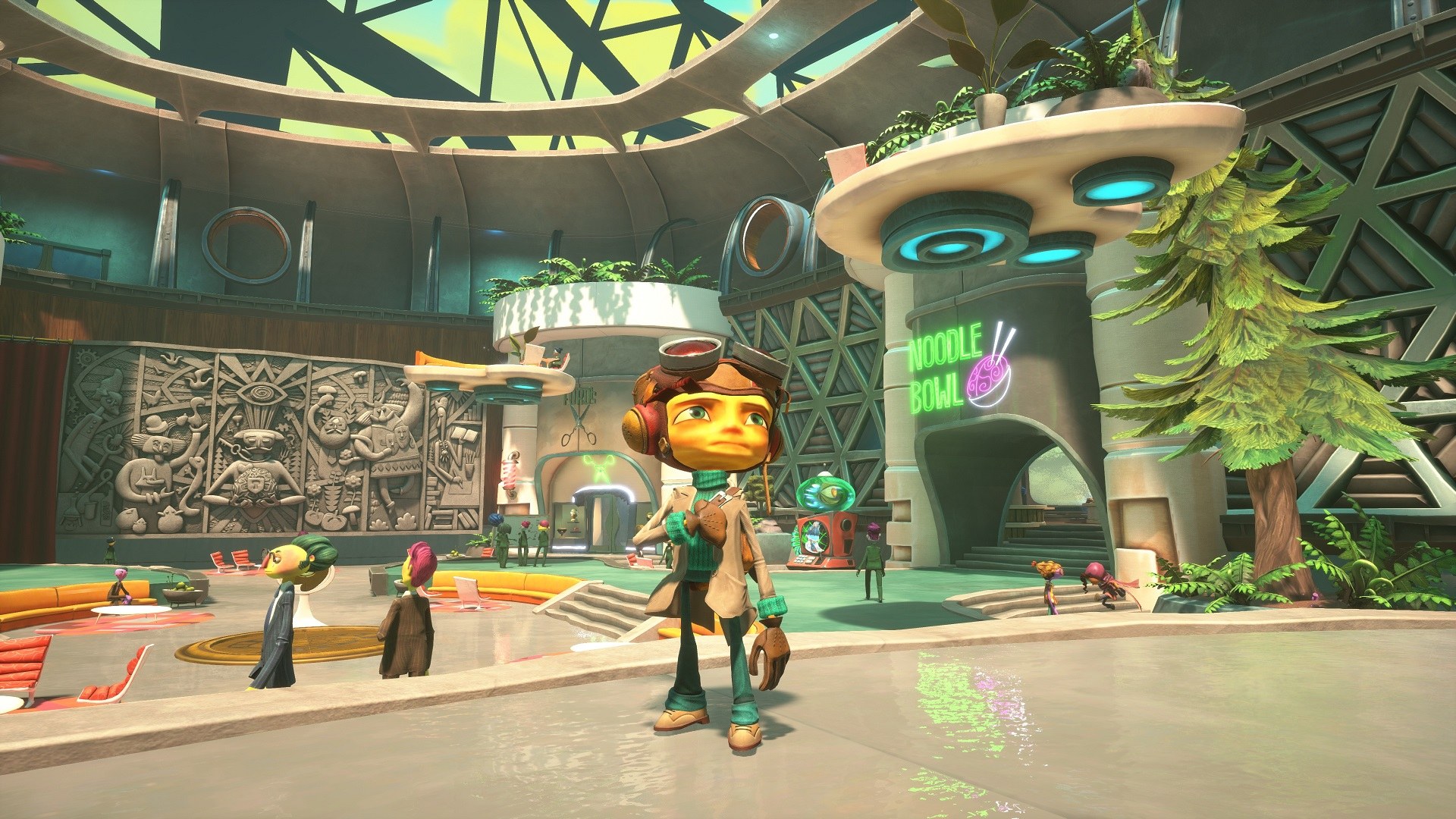 The real world's baseline: 1960s spy-agency modernism, warm bounce light, hand-painted concrete relief on the left wall. Everything soft-edged and slightly hand-sculpted. This is the "normal" the mental worlds deviate from.
Per-level render identity
Each mental world gets its own palette, lighting model, and post-process treatment. Two examples where the effect is the mechanic:
The PSI King's Sensorium: post-processing as a symptom
The PSI King is a brain that has spent years in a jar with no senses. When he gets a temporary body, everything arrives at once. The level renders that as sensory overload applied to the frame itself.
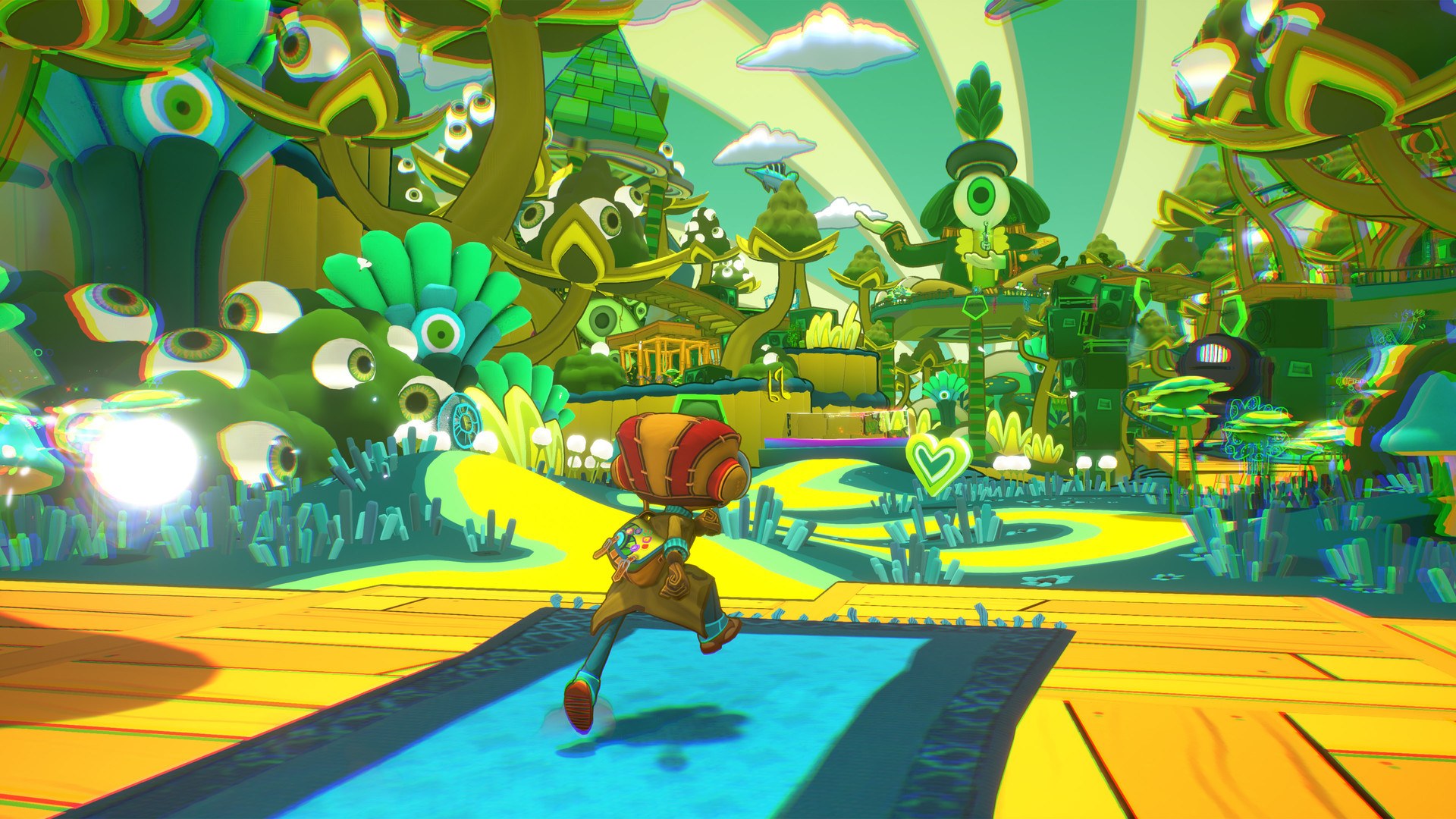 Chromatic aberration is pushed far past the usual tasteful film-grain amount: every silhouette splits into red/cyan fringes, the sky is banded in psychedelic swirls, and the flora is made of eyeballs. The player is being made to experience a perceptual system that is not calibrated yet.
The team's own account of this level names a real production problem worth stealing the fix from: a strong stylistic commitment fought legibility. Prioritising 2D shaders and a dominant green palette flattened depth cues, so players could not read the platforming space. The solution wasn't to soften the style, it was to add high-contrast local elements that carry the navigational load:
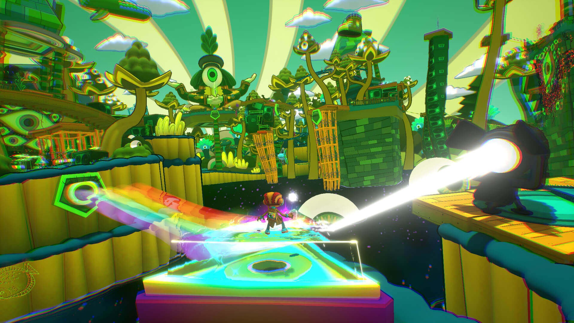 Light-activated prisms and rainbow bridges. They exist because the green-on-green level was unreadable. They then became a mechanic: each stripe of the rainbow bridge plays a different note as you cross it, so walking the path composes a five-note melody. The accessibility fix and the synesthesia metaphor turned out to be the same object.
"That's how panic attacks feel. You just feel chaotic and out of control, so we wanted this enemy to really feel like that." — Lisette Titre-Montgomery, art director, on the Panic Attack enemy's design, via Screen Rant
The design lesson, stated generally: when a stylistic post-process breaks readability, don't dial the style back. Add a diegetic high-contrast element that carries wayfinding, and then give it a mechanical job so it earns its place. This is the same move Breath of the Wild makes with its towers and shrine glow, run at level scale instead of world scale.
Hand-drawn 2D on 3D surfaces
A recurring treatment: flat, neon, marker-pen line art drawn directly onto 3D geometry, as if someone doodled on the inside of a skull. It reads as thought rather than object, which is exactly the distinction the game needs to make constantly.
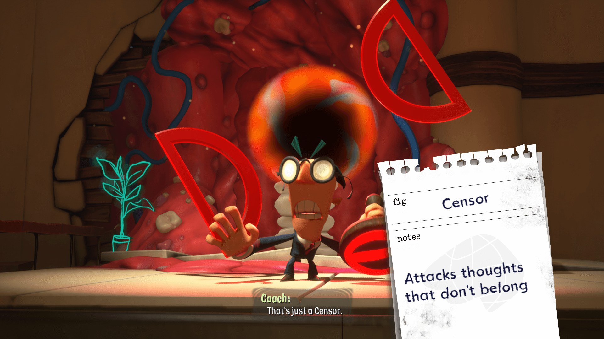 The teal plant and pink cables here are 2D drawings pinned to 3D walls, not modelled objects. Same frame: the enemy-identification notecard, "Censor: Attacks thoughts that don't belong," which is the game's whole UI philosophy in one element (see below). The Censor's own head is a swirling vortex shader, animated, unlike anything else in the frame.
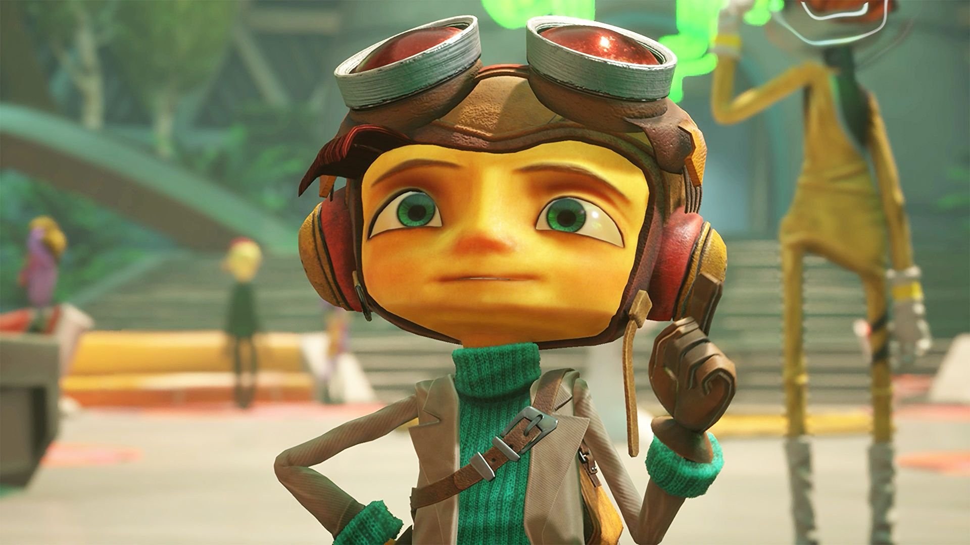 The reason the whole visual system holds together. Raz is ten, and every mental world you see is filtered through his perception, which licenses the scribbles, the eyeball flora, and the crayon-neon VFX.
The stated rationale for the hand-drawn VFX style is that it reflects the childlike state of Raz's mind: he is ten years old, and the mental worlds are rendered by his perception. That is a good example of an art-direction rule that is also a fiction rule, which makes it self-enforcing. When someone asks "should this effect be photoreal?", the answer is derivable rather than a matter of taste.
Morphing the world in place
The most efficient trick in the game: change the level rather than build a new one.
In Hollis' mind, Raz plants a suggestion, and the anatomy classroom becomes a casino on the second visit. Same owner, same conceptual space, different render treatment, different mechanics (betting odds, wagers), different mood. The player's own action caused the transformation, so the visual change is diegetic consequence rather than a set-piece.
This is the cheapest version of the whole per-level-identity idea and the most portable to a small project: one space, two dressings, with the transition caused by a player decision. You get the "no two levels look alike" effect for a fraction of the cost.
The UI is drawn by hand too
Psychonauts 2 keeps its interface inside the fiction, and it does so with paper.
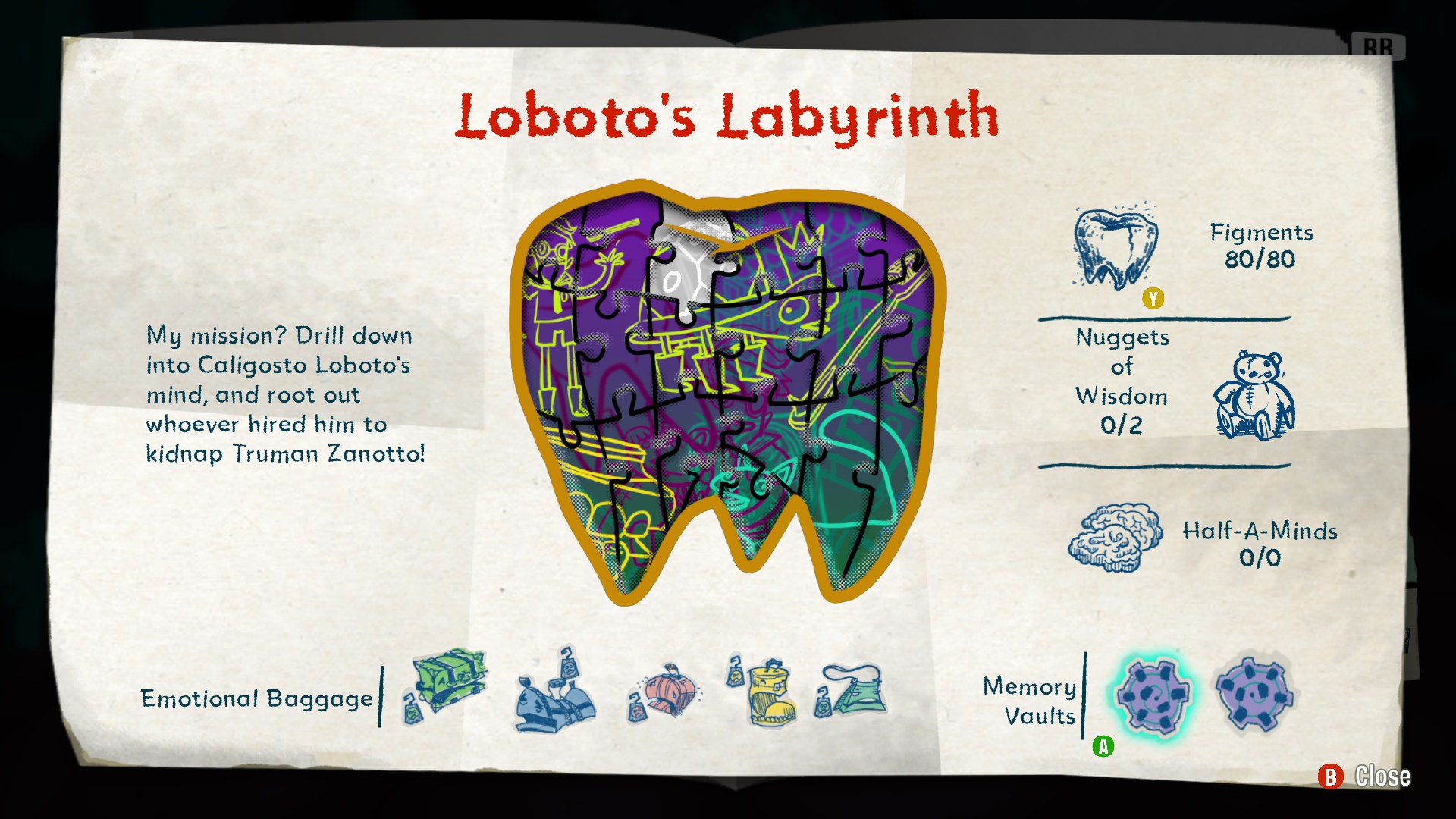 The level-progress screen is a scrapbook page. The completion meter is a jigsaw shaped like a molar (this is a dentist's mind); the collectible icons are pen sketches; the mission statement is handwritten in the level owner's voice: "My mission? Drill down into Caligosto Loboto's mind, and root out whoever hired him to kidnap Truman Zanotto!"
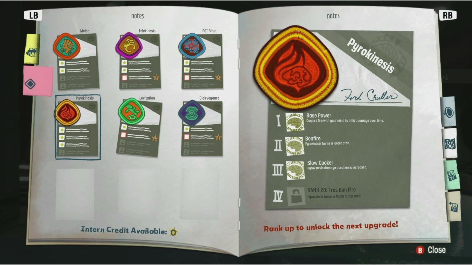 The upgrade tree is a merit-badge scrapbook signed by Ford Cruller, with sticky-note tabs down the edge. Each power is an embroidered patch; each upgrade rank is a certification stamp. Nothing here is a grid of rectangles, and it costs the player nothing in clarity.
The enemy "bestiary" is delivered the same way: a torn notepad page slides into frame the first time you meet a Censor or a Doubt, giving its name and one line of behaviour. It is a tutorial pop-up that is also a joke and also characterisation, and it never once uses the word "tutorial."
Tagged diegetic-ui here, the same pattern Nier: Automata pushes furthest by putting the HUD inside the loadout budget, and that Moonlighter 2 uses for its shop signage. Psychonauts 2's version is the low-risk one: keep the systems conventional, render them in the fiction's handwriting.
What this costs
Be honest about the bill:
- Every level needs its own shader work, VFX pass, palette script, and lighting rig. None of it amortises.
- Readability has to be re-solved per level. The Sensorium's depth-perception problem is not a one-off; it is the standing risk of the approach, and it is found late, in playtest, per level.
- It is a schedule problem, not just a budget problem. Schafer named the cost directly: "We really tried to make every level with its own artstyle and a gameplay twist, something different than all the other levels, and it's part of the reason it takes so long to make these games."
See design tensions for what that did to the project, in the developers' own words and on video.